Data Storytelling with OpenAxis

Share this post
Charts of the week
openaxis.substack.com

Charts of the week

Top charts and datasets featured from the community on OpenAxis

Alex
Apr 26
Comment1
Share

GOOD DAY FELLOW DATA WARRIORS! 👋📊⚔️

Welcome to the second edition of Charts of the week where we feature the top charts from the community of data explorers and storytellers on the OpenAxis beta platform. Each visualization has a backlink to access the chart and explore the dataset with tools for collaboration and crowdsourcing insights!


Remix the chart on OpenAxis

Remix the chart on OpenAxis

Remix the chart on OpenAxis

Remix the chart on OpenAxis

Explore the data on OpenAxis

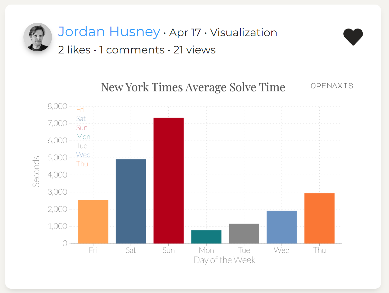
And sometimes you just want to use OpenAxis to visualize your New York Times crossword solve statistics!


If you’re interested in easily telling stories with data among a community of data explorers and storytellers, then sign up and join our beta today! We feature users on the platform and highlight their content weekly.

Join beta now

Thanks for reading Data Storytelling with OpenAxis! Subscribe for free to receive this Charts of the Week newsletter.

Comment1
ShareShare

Create your profile

0 subscriptions will be displayed on your profile (edit)

Skip for now

Only paid subscribers can comment on this post

Already a paid subscriber? Sign in

Check your email

For your security, we need to re-authenticate you.

Click the link we sent to , or click here to sign in.

Sam
Apr 26Liked by Alex

This is very cool!

Expand full comment
Reply
TopNewCommunity

No posts

Ready for more?

© 2022 OpenAxis, Inc.
Privacy ∙ Terms ∙ Collection notice
Publish on Substack Get the app
Substack is the home for great writing