Data Storytelling with OpenAxis

Share this post

Charts of the week

openaxis.substack.com

Charts of the week

Top charts and datasets featured from the community on OpenAxis

Alex
Oct 26, 2022
3
Share
Share this post

Charts of the week

openaxis.substack.com

HELLO DATA STORYTELLERS! 📊😎

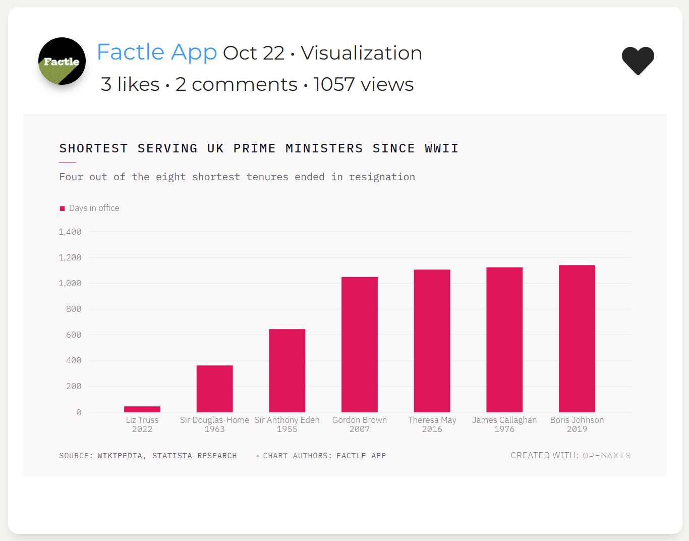
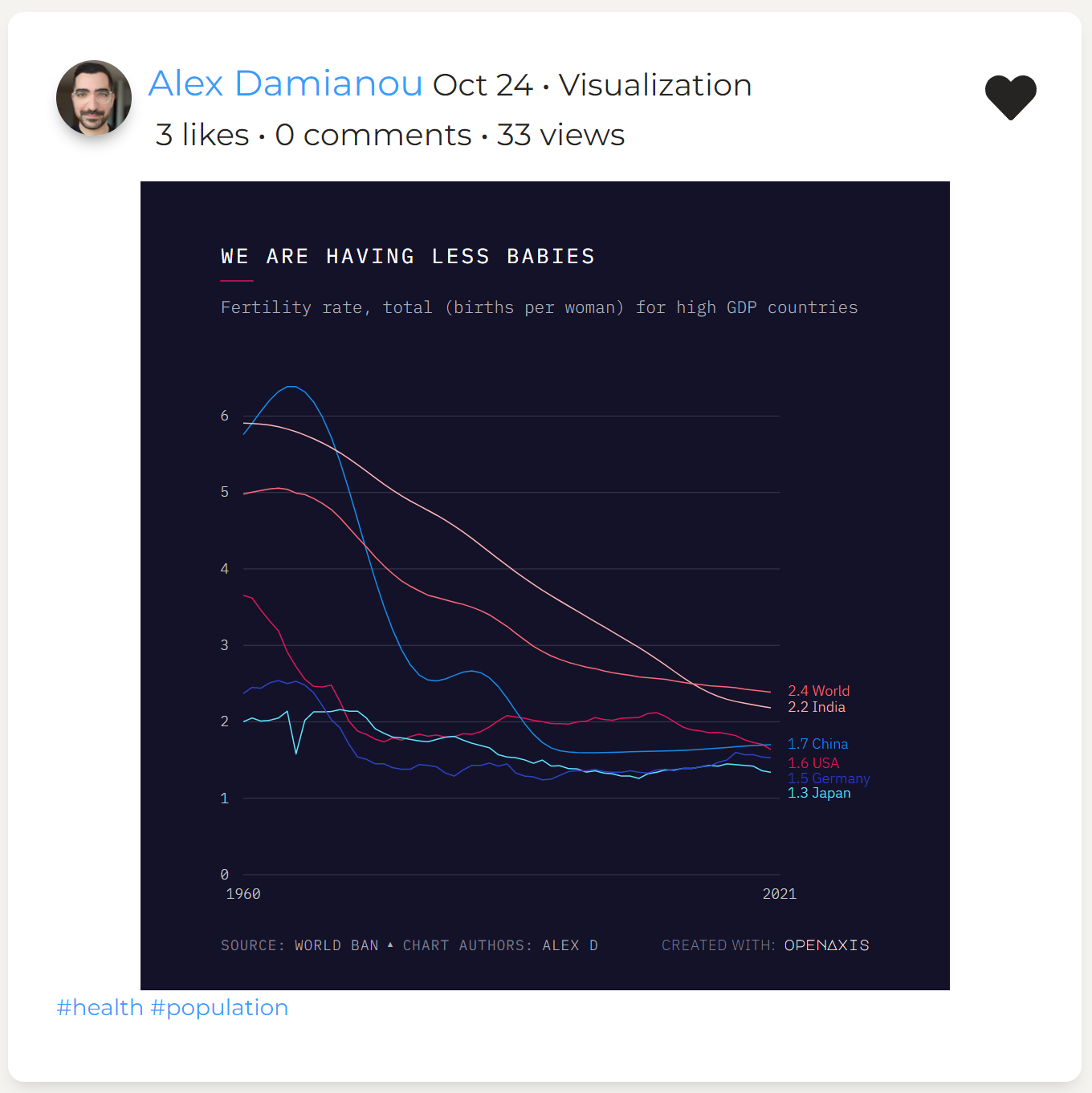
Welcome to Charts of the week where we feature the top charts from the community of data explorers and storytellers on the OpenAxis beta platform.

Each visualization has a backlink to access and download the interactive chart and explore the dataset with tools for collaboration and crowdsourcing insights!

Our new easy to use chart creator and interactive templates are now available. Join 20,000 MAUs already on the beta here today! Or sign up for a live demo here.


Explore interactive chart & data

Explore interactive chart & data

Explore interactive chart & data

Explore interactive chart & data

Explore interactive chart & data


If you’re interested in easily telling stories with data among a community of data explorers and storytellers, then sign up and join our beta today! We feature users on the platform and highlight their content weekly.

Sign up for beta

Thanks for reading Data Storytelling with OpenAxis! Subscribe for free to receive this Charts of the Week newsletter.

3
Share
Share this post

Charts of the week

openaxis.substack.com
Comments
Top
New
Community

No posts

Ready for more?

© 2023 OpenAxis, Inc.
Privacy ∙ Terms ∙ Collection notice
Start WritingGet the app
Substack is the home for great writing